
print assets
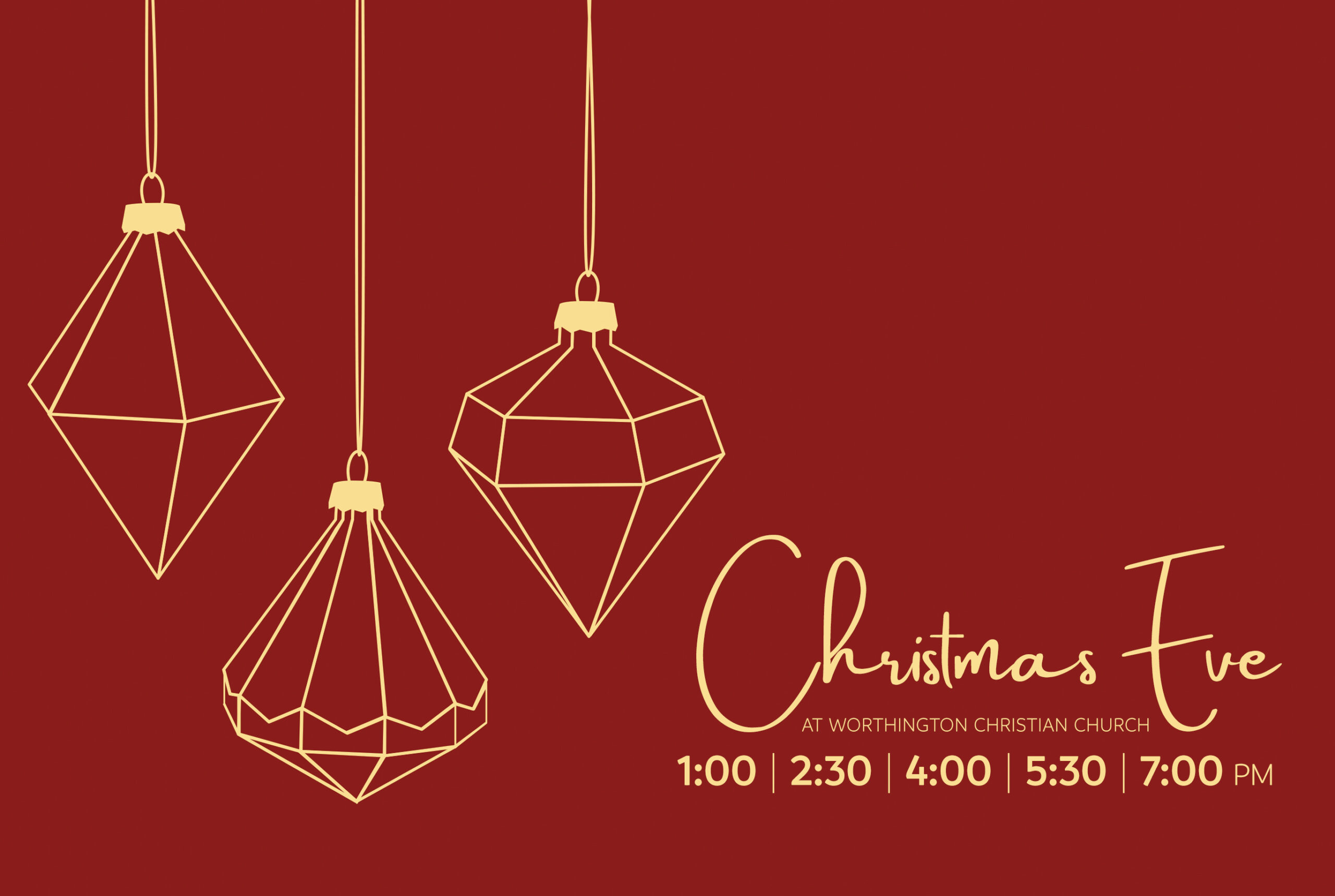
The theme for the Christmas sermon series was ‘Christmas is for Everyone’ with a close-up of a tag on a Christmas tree. While that artwork was very effective for sermon graphics, I didn’t feel it translated well into a Christmas Eve mailer that would be competing with other Christmas Eve mailers from various central Ohio churches. I wanted the Worthington Christian Church mailer to be bold and stand out.
For this concept, I went with an eye-catching, warm red background and gold lettering. The line art for the ornaments is directly tied to the Christmas decor in the Worship Center. The design utilized white space to draw the eye down to the event, location, and times. The font used for the headline ‘Christmas Eve’ was later changed to match the sermon artwork (a bold serif). The direction of this concept art was well received (use of red, simplicity), but since the sermon artwork depicted an ornament on a tree, stakeholders wanted to lean more in that direction. In the end, I presented a concept that was a mix of a purchased template with my tweaks.
This was the final design that ended up in people’s mailboxes.
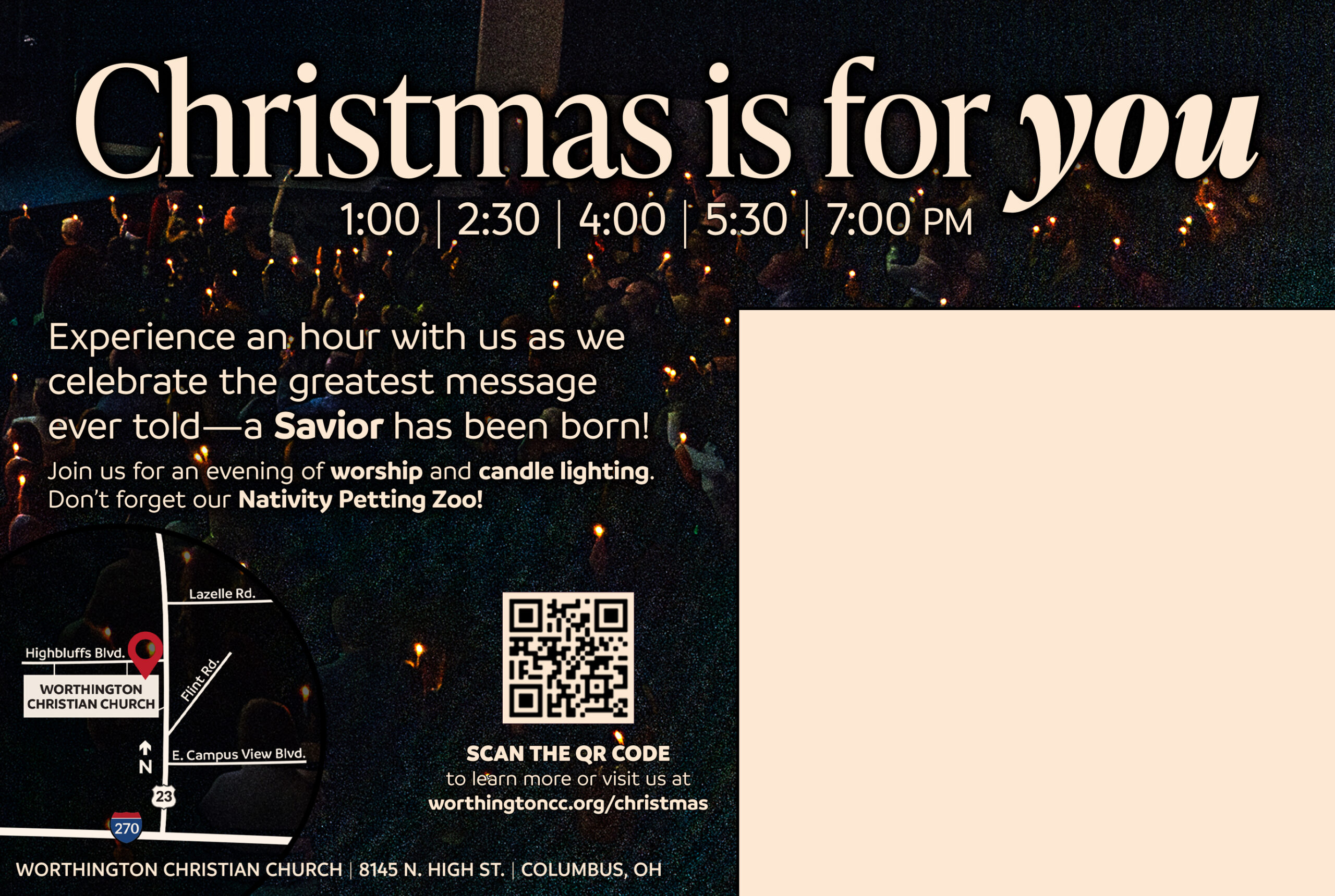
The reverse side of the Christmas Eve mailer used a photograph taken during the candle-lighting at a Christmas Eve service (2024) as the background, overlaid with warm white text. The font used for the headline, ‘Christmas is for you,’ matches the font used in the sermon artwork. The map was drawn in Illustrator, and the mailer was designed in Photoshop.

The theme and concept I was presented with for the 2024 Christmas sermon series was ‘Finding Peace,’ with an emphasis on the manger with a gold-and-ivory color scheme. With such a simple theme and similar color palette, I leaned into a gold-textured feel for the artwork by using a gold foil effect on the text and manger line drawing. This increased the contrast against the ivory background, both in color and in feel.
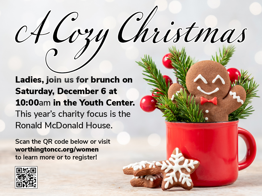
This simple but eye-catching postcard was designed to be printed in-house on a Canon copier on cardstock and handed out to ladies on Sunday morning at Worthington Christian Church. The photo of a gingerbread man in a cup of hot cocoa came from Adobe Stock, but I had to edit the photo so I could use it in a wide variety of formats, including 22×28″ posters, 11×17 signage, and postcard-sized handouts. The Women’s Ministry liked the artwork so much that they tried to emulate my design in their tabletop displays.
In 2023, Worthington Christian Church launched the REACH Initiative. This initiative had three goals: to update and remodel the church facility, to purchase additional property for a satellite church, and update the church technology for a better worship experience, both in person and online. I designed the branding for the REACH Initiative and all related print and digital assets. I also wrote most of the copy for all of the promotional materials.
This brochure was a double-fold, mailed to all WCC members (along with a letter from the Lead Minister) and made available for pickup at the church.
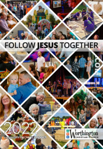
I developed an Annual Engagement Report for Worthington Christian Church in 2021, to be distributed as a PDF via email. However, I designed the PDF to be easily printed on a Canon copier, as the leadership also wanted to make it available for pickup on Sunday morning. I kept the design of the report simple with engagement statistics and data easily read at a glance. I made it a point to include information on how readers can download the church app or subscribe to the weekly email newsletter, along with stats for each digital platform.
I updated this design for the 2022 Engagement Report. In 2023, the report was moved to the church website. A screenshot of that report is available here.

Rooted is a 10-week study at Worthington Christian Church that will repeat two or three times a year. The goal of Rooted is to help Christians connect with God and develop their faith. The branding for Rooted was provided by the company that designed the program and featured a logo of tree roots. I designed all church promotional materials to reflect this motif, using green, gold, and white as the primary color scheme and plant growth as the primary image in all print materials.

The Men’s Event is a quarterly gathering of men for fellowship, Bible study, and BBQ (weather permitting). The original design for the Men’s Event promotional materials was a simple blue background with a text effect for the headline. After over a year of using that design, I felt it needed a bold refresh not only to match the updated print designs for other ministries but also to make the poster more eye-catching and effective. I went with an orange, black, and white color scheme with a background image of a blacksmith, which leaned into Proverbs 27:17, “As iron sharpens iron, so one person sharpens another.”

To encourage recruitment for the Worship Arts Ministry, I designed a poster with an image of a member of the Tech Team and a sheet music background in an attempt to marry the two wings of the Worship Arts Ministry. When most people think of ‘Worship Arts,’ they think of music and singing, and not necessarily the more technical skills of running the cameras, directing shots, managing the soundboard, etc. For this reason, I wanted to emphasize the less-obvious side of Worship Arts, the tech team. The Worship Arts Ministry Team Kickoff had a great turnout and was a success for recruitment.

Fall Fest is an annual event at Worthington Christian Church held every October. It is also one of the most popular community events that WCC hosts. In addition to developing visual communications for internal Fall Fest promotion, I drove external promotion primarily through paid Facebook and Instagram advertising, resulting in WCC’s largest-ever Fall Fest attendance in 2022. This design has proven to be the most versatile, making it easy to use as a poster, handout, tabletop sign, or postcard.
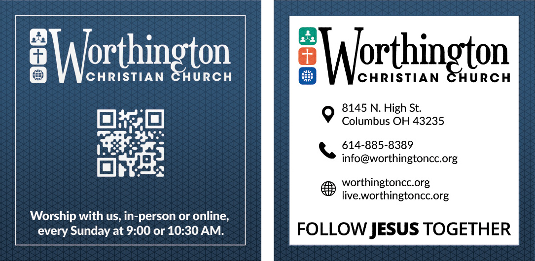
When it was time to update Worthington Christian Church’s business cards, I didn’t want them to be confused with their Invite Cards, so I chose to design them in an unusual size: square. The card design is simple and universal, allowing anyone on staff to use it.
This approach and design saved the church quite a bit of money, but did not eliminate the need for more personalized cards for the Lead Minister, Outreach Minister, etc. However, due to discussions about a possible name change for the church, the design and production of more personalized business cards were put on hold.
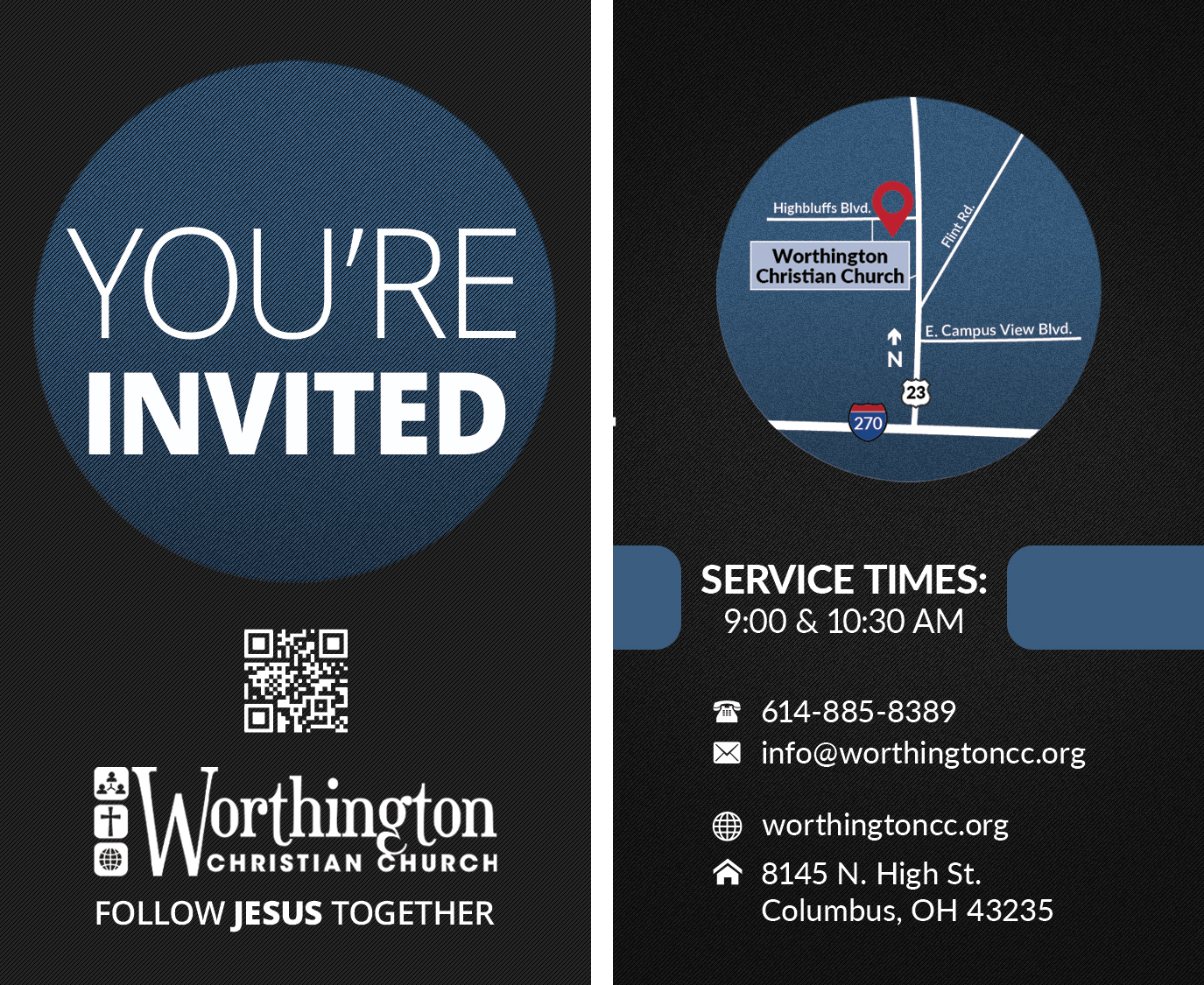
Standard business-card size, this simple invite card was available to WCC members to hand out to their neighbors, coworkers, or friends. Ministers and ministry leaders frequently used this card as well. The simple design provides basic information about the church, and the QR code links directly to the WCC LinkTree, which I would update on a weekly (sometimes daily) basis. This invite card was useful not only for inviting people to attend church but also for inviting them to the various events featured on the WCC LinkTree page.

I designed a series of yard signs for the Sawmill Forest Civic Association that would be displayed in the yards of ‘best decorated’ homes for Halloween or Christmas. I designed four yard signs per holiday using fun, vector illustrations and bold colors to be easily seen from the street.

I designed a series of yard signs for the Sawmill Forest Civic Association that would be displayed in the yards of ‘best decorated’ homes for Halloween or Christmas. I designed four yard signs per holiday using fun, vector illustrations and bold colors to be easily seen from the street.
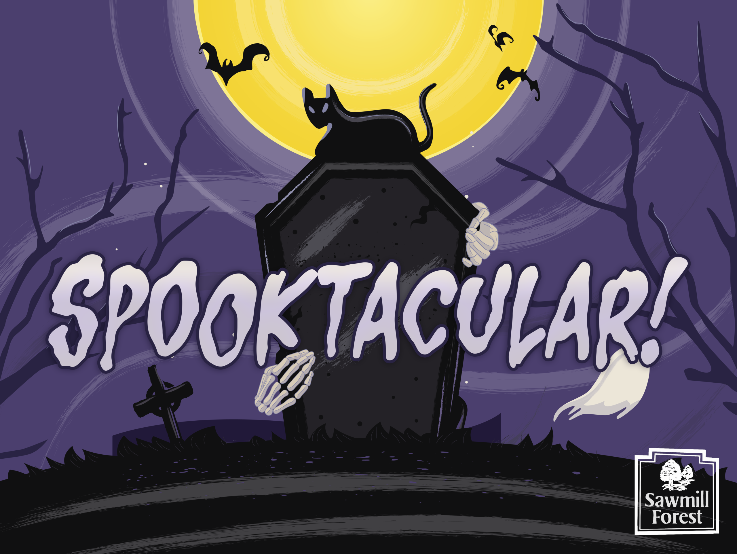
I designed a series of yard signs for the Sawmill Forest Civic Association that would be displayed in the yards of ‘best decorated’ homes for Halloween or Christmas. I designed four yard signs per holiday using fun, vector illustrations and bold colors to be easily seen from the street.

I designed a series of yard signs for the Sawmill Forest Civic Association that would be displayed in the yards of ‘best decorated’ homes for Halloween or Christmas. I designed four yard signs per holiday using fun, vector illustrations and bold colors to be easily seen from the street.
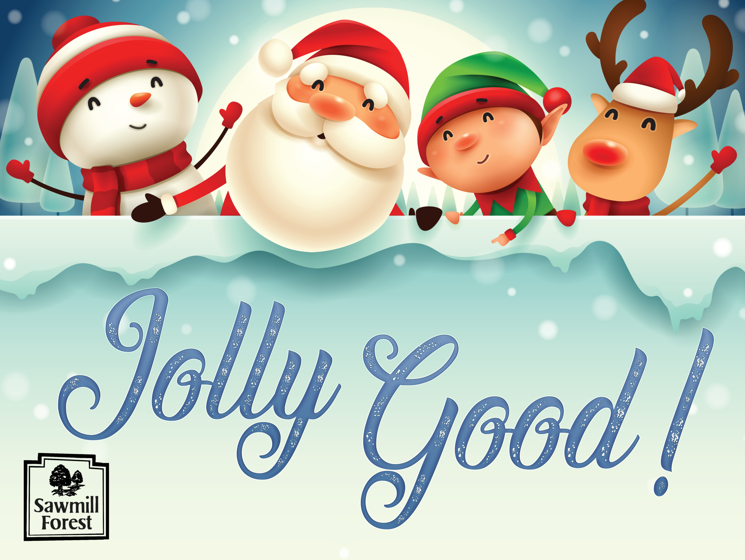
I designed a series of yard signs for the Sawmill Forest Civic Association that would be displayed in the yards of ‘best decorated’ homes for Halloween or Christmas. I designed four yard signs per holiday using fun, vector illustrations and bold colors to be easily seen from the street.

I designed a series of yard signs for the Sawmill Forest Civic Association that would be displayed in the yards of ‘best decorated’ homes for Halloween or Christmas. I designed four yard signs per holiday using fun, vector illustrations and bold colors to be easily seen from the street.
