
message artwork
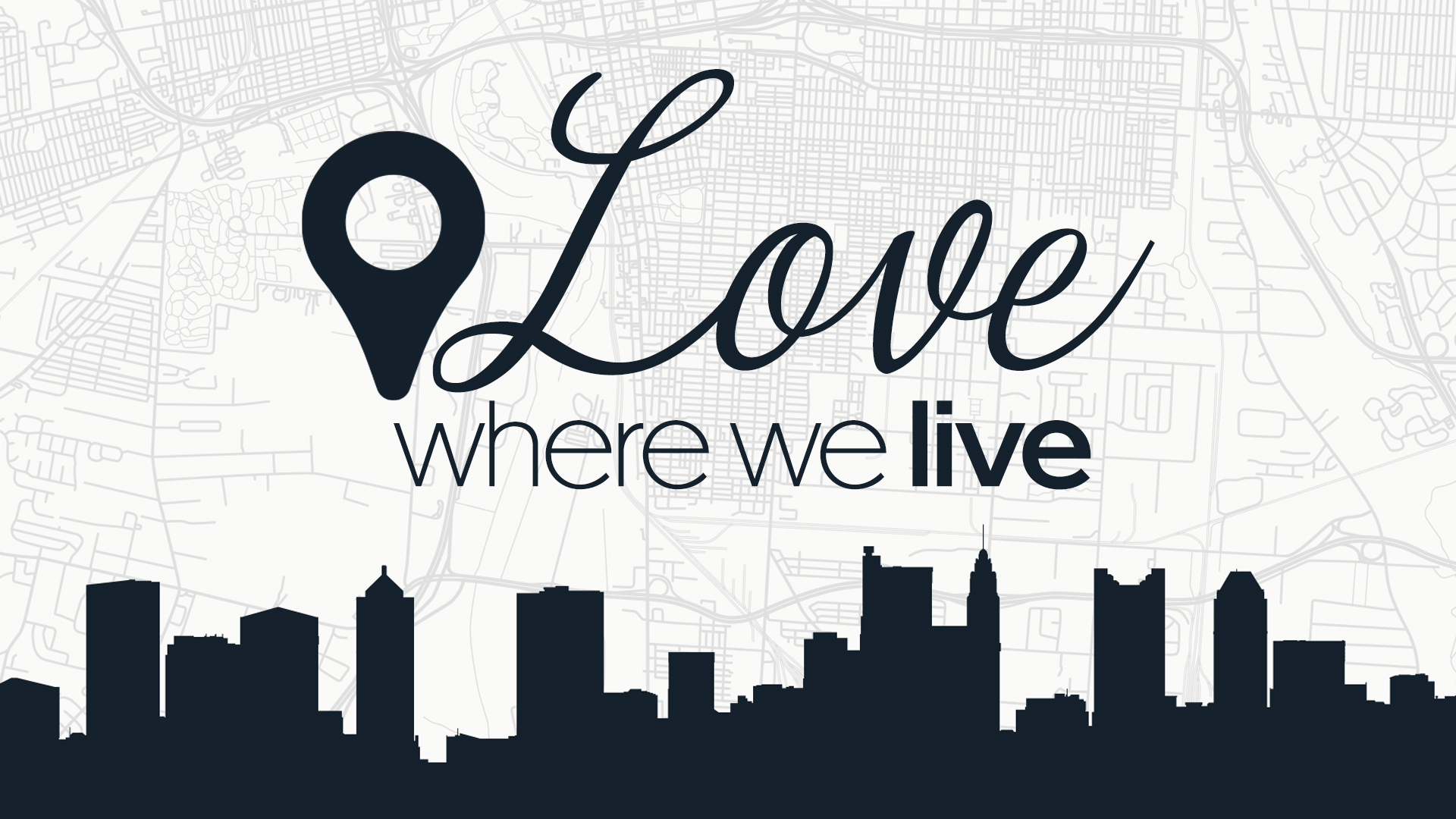
The ‘Love Where We Live’ series was meant to emphasize loving our neighbor and, therefore, loving our community. I overlaid a silhouette vector image of the downtown Columbus skyline on a street map of Columbus with a map icon. I wanted a more generic representation of Columbus to signify all of central Ohio without losing the familiarity of “home.” The street map and map icon were accepted, but the focus shifted north to center on the church’s location.


Concept art. Modern title treatment for message series, ‘We Stand Again,’ featuring an AI-generated crumbling wall with flowers. The artwork is meant to depict that beautiful things can grow from the brokenness of our lives.

Concept art for ‘Fruit That Will Last’ featuring a customized label on an orange with a message title and primary scripture text. This concept was intentionally designed to be a bit lighthearted for a message series with a heavy theme while also leaning on the reality that earthly fruit does not last; only heavenly fruit does. The message series was renamed ‘We Remain.’

Artwork for the Easter sermon series featuring a sunrise with clouds overlaid on title text. That Easter artwork matches the Good Friday artwork. The Good Friday artwork is dark and ominous with brightly colored text, representing hope. The Easter artwork shows the hope of sunrise, while the text is overlaid with clouds, representing the lingering grief felt by those who don’t yet know that He has risen.
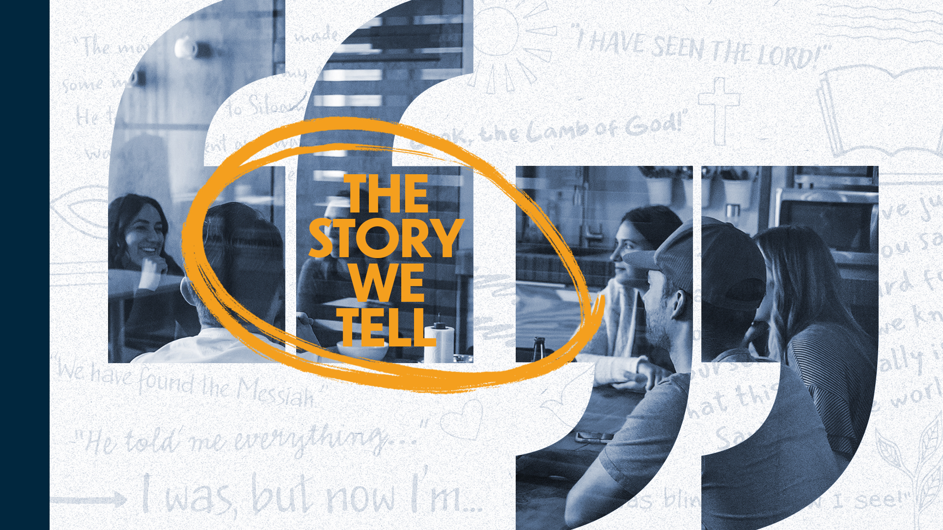
Artwork for ‘The Story We Tell’ featuring an image of a group of people conversing at a kitchen table overlaid with quotation marks. The background is meant to feel like a journal and features scripture quotes.

Long conversations often happen over a cup of coffee. This concept art was designed with that in mind. While this design was ultimately rejected, it was a worthwhile exercise for improving my Photoshop skills.

Our core values are the foundation of who we are as individuals and as a community — it’s our DNA. The original title for this message series was simply ‘Our Core Values.’ I suggested a rename to ‘What Makes Us’ when I developed this art as a concept.
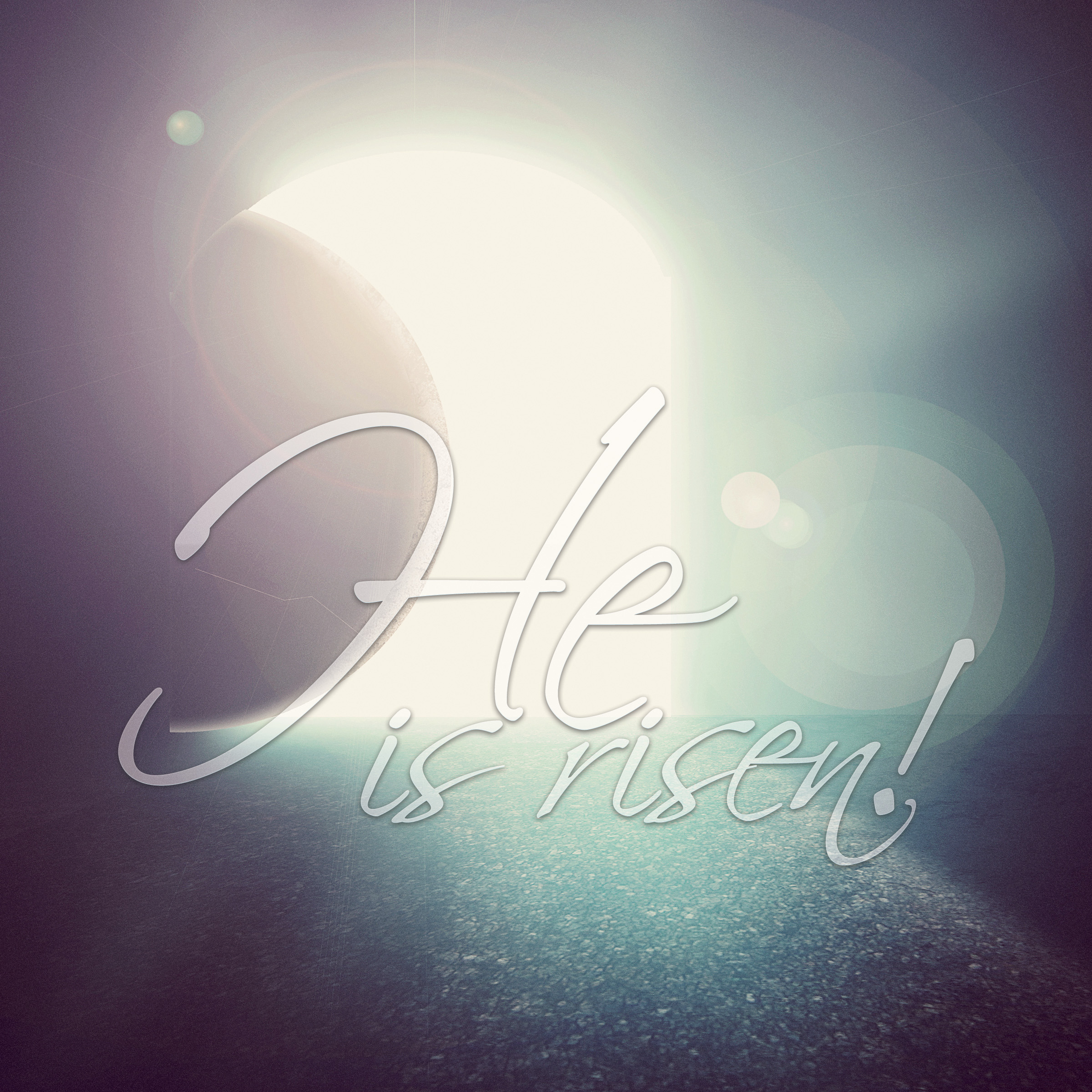
Easter bulletin artwork. The series was titled ‘He is Risen,’ and that text needed to appear with the artwork, but I didn’t want the text to compete with or overpower the image of the empty tomb. For that reason, I chose to make the text semi-transparent and tried to lean into the curve of the stone with my font choice. In retrospect, I feel I should have made the text smaller and not centered it over the artwork.

The Christmas.Gif series was a playful take on the holiday season, leaning into the fun of Christmas. Several aspects of the Christmas.Gif artwork were isolated low-poly-count images pulled together to create the scene.
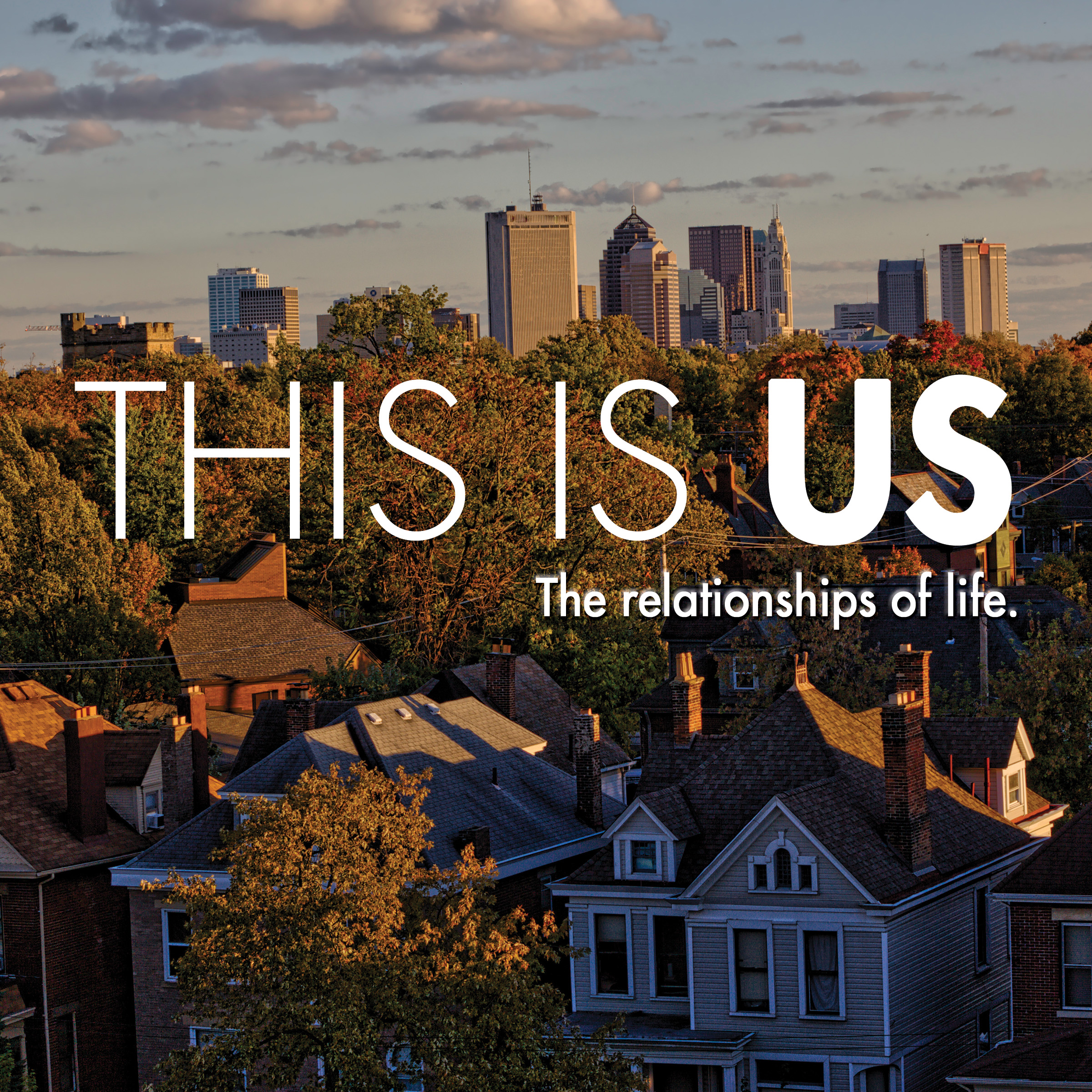
Message artwork focused on relationships. I used a photo showing downtown Columbus from a nearby suburb to make the series feel more personal and relatable. Several of our members live in the suburbs but commute downtown.
